Monday, December 16, 2013

Rules of Photography Part II

 rule of thirds

balance


lines


simplicity

framing


avoiding mergers


symmetry and pattern


viewpoint

depth

crop


Thursday, December 12, 2013

caption writting


1. Curtis Reagan steals a kiss from Lois Lane on Friday in Times Square in New York City. Reagan snatched a kiss joyfully from Lane after the announcement that the allies had defeated the Nazis, ending       World War II.

2.
  

 A teenager with psychological problems thoughtlessly started shooting teachers and students for no good reasons at Sandy Hook Elementary School. After the shooting incident teachers and police officers lead students in a single file line to safety.


3.


On Sept.11,2001 there was a terrorist attack on one of the highest building in New York. A man flew right into the building causing many deaths including the unfortunate man who's falling in the picture.


4.
.

1970 at Kent University there was a group of students going against wars. In the group guardsmen fired   killing four students and wound nine. Mary Ann Vecchio screams as she kneels over the dead body of her friend Jeffrey Miller.


5.


There was a sudden explosion out of no where. A firefighter Chris Fields came out holding a dying baby in his arms. The bombing cause 168 of innocent lives.


6


People were badly injured and three died at the Boston Marathon by explosions, not one but many. The explosions caused more then 100 injured. After what had happened Iffrig was still determined to finish the race.


Tuesday, December 10, 2013

The Three Pillars of Exposure: Aperture, ISO, Shutter Speed

F2.8

F16
1. Pupil 
2. the smaller the Aperture the bigger the number, the higher the Aperture the smaller the number.
3. the size of the aperture affects how much of the picture is clear

high shutter speed

slow shutter speed 


reasonable light

a) fast
b) medium
c) medium
d) medium
e) fast
f) fast


dark

a) medium
b) slow
c)medium
d) medium
e)medium
f) medium


Auto: both shutter speed and aperture is automatically set by the camera

Aperture Priority: shutter speed is set by camera and the aperture is set to your liking

Shutter Priority: aperture is set by camera and the shutter is set to your liking

200 iso

3200 iso

1. when taking pictures in the dark the iso should be high to quickly capture an image.
2. that you should always use the lowest iso when possible. when taking pictures with plenty of light, the iso should be at its lowest to have the most detailed and highest image quality.
3. that you should have a high iso when taking pictures in the dark to freeze motion and quickly capture the picture


  • 1/125
  • 1/60
  • 1/60
  • 1/60
  • 1/30
  • 1/30
The background get clearer with every increase in aperture.

It gets blurry, the photographer can in the shutter speed for the picture to look better.

i would say 1/30

I did good and now have a better understanding of aperture, shutter speed, and ISO.


Wednesday, October 30, 2013

Great Black and White Photographers Part 3

The first thing that caught my eyes was the setting of both pictures. The setting of the first one that i picked reminded me so much of home town and the fact that the setting of picture is similar to where my family came from. The second picture really catches my eyes because the place seems so interesting and creative the way i sees it, it's a place of art.

I see beautiful constructed buildings
I smell the cool and fresh air
I hear people singing while boat riding foreign visitors in the river
I taste evaporated h2o from the river
I feel the wind rushing by my Asian skin

I would like to create a collection of photos from my great photographer to share my thoughts and ideas of this artist.

Friday, October 25, 2013

Africa and Mural Project


  1. I thought the power point was very interesting with the animals of Africa.


             3. The slanted tree over a lion laying down.
                 This is my favorite because this can be an example of framing, how the tree's framing the lion.

             4. Framing is the evident rule in this picture, because the slanted tree is framing above the lion.

            5. 
     a. medium-format black and white film without telephoto or zoom lenses.He uses a Pentax 6711 with only two fixed lenses.

b.to record a last testament to the wild animals and places there before they are destroyed by the                                                       hands of man.       
           
     c. he hopes for the animals to never vanished in the future.

     d. "You wouldn't take a portrait of a human being from a hundred feet away and expect to capture their spirit; you'd move in close."


Mural Project:
1. I would use the theme blue and gold for my mural for Akins and the subjects would be the students of Akins doing their usual school activities.

2. It is worth devoting the time and effort over because if this project come out great then we have a story of Akins High through art. The other students would care about this theme because this art project is going to be about them.

3. The advantage of a phone camera is that we can take the photos without them knowing and get their             
natural image. The disadvantage is that the picture won't come out as great 

4.The advantages of using an SLR camera are that the pictures comes out great and clear. The disadvantages are that the subject won't be natural and that some students might feel uncomfortable and will face the opposite way of the camera

5.In my opinion i think that we should use the SLR camera because it makes clearer pictures in which will make a clearer story of Akins High.


Thursday, October 17, 2013

Academic Shoot reflection


  1. Trying to be in the right angle and finding a place that fits the rule.
  2. Focus would be the one that i find myself struggling with, an example is that when taking a picture, we have to make sure that the picture is focused, it is focused depends on the distance between the subject and the camera
  3. I would have use the flashed button to make the picture look better.
  4. Not taking the picture straightly but a little slanted to the side, i believe that it makes the picture more interesting.
  5. The easiest would have to be Framing.
  6. The hardest would have to be Avoiding Mergers.
  7. I am clear on the rules but if there is i would research it on the internet or ask the teacher.

Academics Shoot

Line:
  1. Not very well, it would be better it there was a subject.
  2. Books but i used the edges of the books to describe lines.
  3. Not exactly to the point.
  4. I could've used something else that would be more directly.


Simplicity:

  1. I followed the rule pretty well because i have a subject and a simple background behind.
  2. The subject is the girl.
  3. Yes, definitely.


Rule of Thirds:

  1. Not so well even though it is a rule of thirds picture but there's a merger as the girls face got cut off.
  2. The boy in the T-shirt and wearing a red necklace.
  3. Yes
  4. I could've cut the girl out.


Balance:
  1. I followed the rule well.
  2. The two girls studying.
  3. yes


Framing:
  1. I followed the rule well.
  2. The guy walking 
  3. yes


Avoiding Mergers:
  1. I followed the rule well
  2. The girls that are beside the mirror and in a straight line but the top of those girls on the bottom corner are the mergers of the picture.
  3. Yes

Academics Shoot Preview

Best Story
I picked this photo because i can see that they are doing community service


Action or Emotion


I picked this picture because it contains the interesting project for science


Fills the Frame with the Most Interesting Stuff

I picked this picture because the group fills up the whole frame

Academics and community service
I chose this picture because its in a classroom and a teacher teaching.

avoiding mergers, color, and value.


  1. art classroom
  2. classes that has lots of space and interesting stuff
  3. be in the right angles and see through the arts of the pictures


Wednesday, October 2, 2013

Elements of Art and Principles of Design

Line : Lines are marks made by a pointed tool: brush, pencil, pen, etc. Lines can vary in width, direction, curvature, length, or color.


I chose this painting because of the lines that decorated the walls.


I chose this photo because of the lines that framed the window of the building.

Shape : Shapes are formed wherever the ends of a continuous line meet. Geometric shapes such as circles, triangles or squares have perfect, uniform measurements and don't often appear in nature. Organic shapes are associated with things from the natural world, like plants and animals.


I chose this painting because of the shape of the house, window, and the faces.


I chose this photo because of the shape of the whale.

Color : Color wheels show the primary colors, secondary colors, and the tertiary (intermediate) colors. They also show the relationships between complementary colors across from each other, such as blue and orange; and analogous (similar or related) colors next to each other such as yellow, green, and blue. Black and white may be thought of as colors but, in fact, they are not. White light is the presence of all color; black is the absence of reflected light and therefore the absence of color.


I chose this painting because of the colorful flower.


I chose this picture because the colors made the simple bottle looks nice.

Value (Tone) : Value, or tone, refers to dark and light; the value scale refers to black and white with all gradations of gray in between. Value contrasts help us to see and understand a two-dimensional work of art.

I chose this painting because it helps us to see a two dimensional work of art, the hand and the reflection.

I chose this picture because of the grey between light and dark


Form : Form describes objects that are three-dimensional, having length, width, and height.
I chose this painting because it gives the viewers a three-dimensional view.

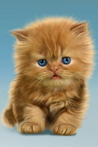
I chose this picture for Form because it gives the viewers the length, width, and height of the apple.

Texture : Texture can be rough, bumpy, slick, scratchy, smooth, silky, soft, prickly--the list is endless. Texture refers to the surface quality, both simulated and actual, of artwork.

I chose this painting for texture because it gives out the bumpy feeling created by the painter.

I chose this picture for texture because by examining this picture the viewers can conclude that the barks are rough and bumpy. 

Space : Space refers to distances or areas around, between, or within components of a piece. Space can be positive (white or light) or negative (black or dark), open or closed,shallow or deep, and two-dimensional or three-dimensional.
I chose this painting because of the huge amount of space between the subject and the field.


This picture represent space because it makes the viewer feels wide open.


Balance :Balance is the comfortable or pleasing arrangement of things in art. There are three different types of balance: symmetrical, asymmetrical, and radial. The human figure is symmetrically balanced; the same on the left and right side. The tree is asymmetrically balanced; its branches are not distributed equally on each side, but their total weight is balanced left and right. The sun is an example of radial balance; all its rays are equal in length from the center.

This would be a balance painting because the guy's left arm is out , right leg back both action represent how he balance.
I chose this picture for balance because the two rows of trees balanced each other out.

Contrast :Contrast is created by using elements that conflict with one another. Often, contrast is created using complementary colors or extremely light and dark values. Contrast creates interest in a piece and often draws the eye to certain areas. It is used to make a painting look interesting.
I chose this for contrast because the plain darkness of the background draws interest to the painting.

This is a picture for contrast because the colorful fish compare to the plain ones are conflicted.


Emphasis :Emphasis in the focal area of an artwork gives it importance. An artist may stress some elements of the design over others. The eye of the viewer will focus on the area of emphasis or center of interest first, then take in the rest of the composition.

I chose this picture for emphasis because the viewers can clearly see that the couple is the center of attention, then the eyes would drawn to the rest of the art work.

This picture would be a perfect example for emphasis because the viewer's eyes would be drawn to eye  ball before observing the rest of the picture.


Movement :Movement in an artwork means the artist is taking viewers on a trip through the work by means of lines, edges, shapes, and colors often leading to the focal area. Movement is a visual flow through the composition. It can be the suggestion of motion in a design as you move from object to object by way of placement and position. Directional movement can be created with a value pattern. It is with the placement of dark and light areas that you can move your attention through the format.
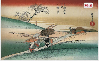
I chose this painting because the pattern of the waves and the direction the waves is pushing boat.
I chose this picture because it shows the movement the skaters in from beginning to endpoint.

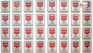
Pattern :Patterns are made in art when the same shapes or elements are repeated again and again. Pattern uses the elements of art in planned or random repetitions to enhance surfaces of paintings or sculptures.
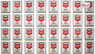
I chose this painting because it shows a patterns of cans
I chose this picture because of the patterns of angles looking like stairs.

Rhythm :Rhythm is the repetition of shapes, lines, and forms. Rhythm is a movement in which some elements recurs regularly. Like a dance, it will have a flow of objects that will seem to be like the beat of music.
This is a painting for rhythm because their gossiping from one popping to another.

this picture is for rhythm because the lines creating the birds is connected which create the effect of one bird jumping to another.

Unity :Unity means that all elements in an artwork are in harmony. Unity brings together a composition with similar units. For example, if your composition was using wavy lines and organic shapes you would stay with those types of lines and not put in even one geometric shape.
This is a painting for unity because the objects are non-changing and similar.


This is a picture for unity because its everything is similar.